#11: Organization
This post was originally written in August 2020. At the time the game was still called Hook, Line and Thinker
The next time I sit down and look at this thing I’ll be critically assessing the todo list and making significant cuts.
Well, I did. I also reorganized all the surviving items on my todo list in a way which has helped a lot with picking this project back up. I figured I’d talk a bit about that.
Design notes and task tracking
Way back when this was a game jam game I just had the whole thing in my head, then as I continued to work on it I maintained an increasingly elaborate .txt file full of notes, TODOs and finished tasks. At some point I admitted defeat and set up a proper task tracking kanban board on Trello. I’d used Trello for a few small projects at university and it was fine. I didn’t particularly like it, but it got the job done.
One major frustration I had at the time was design notes. Early on when I was working on the puzzle mechanics and level designs there were a lot of complex design problems to solve and I would often write long design documents for myself, laying out what the issue was and how I might go about solving it. These did not fill well at all on Trello, and I didn’t really know where to put them.
Around that time the developers of Ooblets wrote an article about how they use Notion. I tried it out, liked it immensely, and have since moved a lot of notes and documents over to it for various projects, including this one.
Notion has a really interesting ‘block-based’ editing style which I find works very well. A block could be a paragraph of text, an image, a table, some code, a bullet point, a checkbox, etc. A page is a collection of blocks, and blocks can easily be converted to other types. For example you might write a paragraph of text, then split it into separate sentences and make each one a checklist block; now you have a todo list.
Notion is available online, as a desktop app and as a mobile app. It’s free at the scale I’m using it, including collaborating with Andrew (he can access and make edits in the workspace). I’m not sponsored or anything, I just find it refreshingly good.
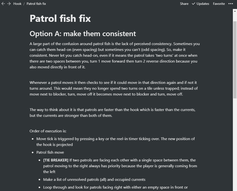
For example here is part of a design document I wrote when I was trying to solve the confusion playtesters felt around the moving patrol fish. Each heading, paragraph and bullet point is a block, and as I was writing them it was easy to rearrange the blocks, convert them, indent them, add new ones and delete others:

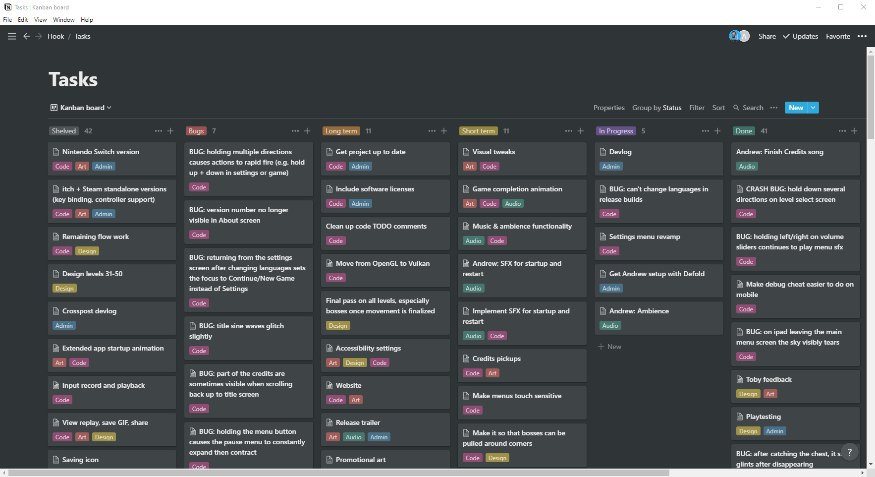
This document is a page within the workspace. This solved my design documents issue, but I didn’t want to be split between different solutions. Thankfully Notion also has kanban-board functionality, and I was even able to import my existing tickets from Trello. Several years later and after my big recent reorganization, this is what the board currently looks like:

You can see from the icons at the top right that Andrew also has access to this page, and I include his name on his tickets so he can search for them (you can assign tickets to members, but 95% of tickets would be assigned to me, so I don’t bother).
I created 6 columns: shelved, bugs, long term, short term, in progress and done. I also created 5 labels: code, art, design, audio and admin. I chose some colors that I liked. This way of organizing the tickets has helped a lot in reducing the noise and mental workload when I decide to sit down and work on something. There are a lot of things I need to do at some point but which it’s unhelpful to worry about now. By splitting my list into short term tasks and long term tasks I can still track everything and add notes and todos when I need to, but I can mentally put it all to one side and focus on what I need to do right now to make progress.
I also grouped lots of related small tasks into big single tickets with detailed checklists. This stops the board from having an overwhelming number of tasks on it, and it lets me get a lot of progress done in one area at a time as I rebuild familiarity with it. Andrew and I drag a ticket to the in progress column while we’re working on it, and to the top of the done column when it’s finished; this helps with communication and planning, and it also just feels good. Moving a ticket to done is a nice reward.
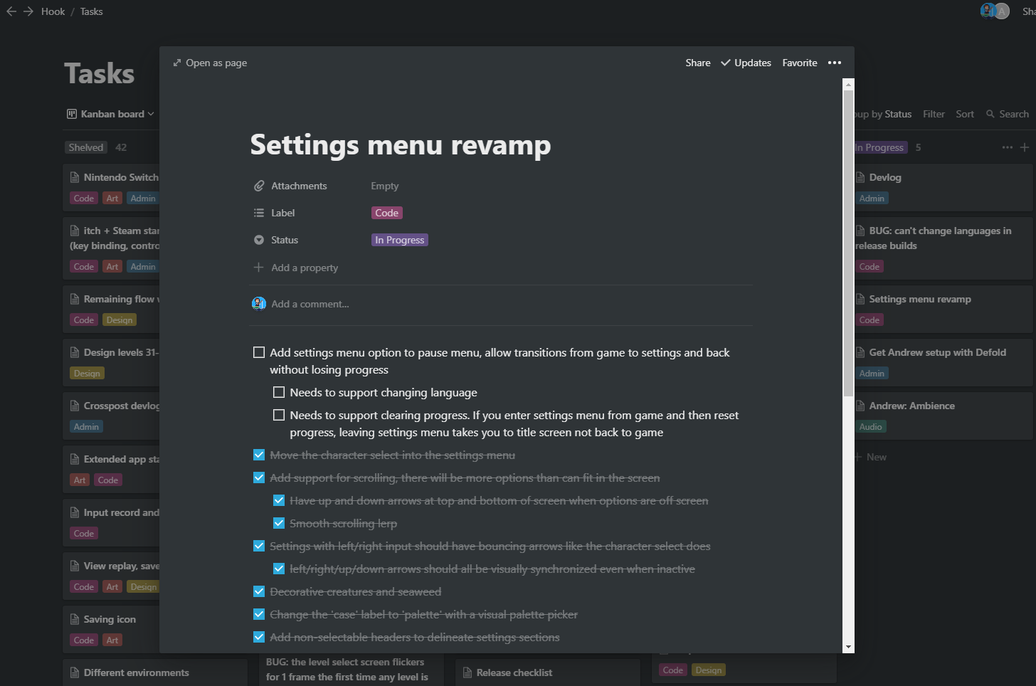
Each ticket is itself a separate page. They can be viewed as an overlay for quick edits, or expanded to their full form. Again I find the block-based editing works really well here; I can interleave paragraphs, checklists and images as and when I need to. As an example here is the main ticket I’m currently working on:

Cut features
As you can see from the number of tickets in each column, I cut about as much work as I’ve already done. Talk about feature creep! The biggest and most painful thing to cut was the flowing water. I spoke a little about this mechanic in devlog 8. Flowing water took several months of work because there were extremely complex design problems to solve and it required massive tech rewrites; the gameplay was changing from ‘each movement tick, the hook can cause one interaction to occur’ to ‘each movement tick, the hook and every flowing water tile can cause one or more possibly-conflicting interactions to occur within a series of multidirectional dependency chains spread throughout the level’. It’s probably the most complex problem I’ve solved so far in 4 years as a professional game programmer.
The kicker was, it wasn’t fun. Turns out this was very much a “so preoccupied with whether or not they could, they didn’t stop to think if they should” kind of scenario. What I should have done was hacked in some debug functionality that allowed me to move around creatures manually, so that I could simulate the flowing water mechanic by hand and see if I could make some interesting puzzles with it. Even a paper prototype may have helped.
I’m sure many interesting puzzle games have and will be made using mechanics similar to the flowing water, but it just doesn’t fit with this game’s existing mechanics. The player movement, the basis of all the puzzles, is centred around working out what path to take and when. Every step matters, but flowing water forces the player along a specific path. The design constraints which make most of the levels work now conspire against the flowing water. With only a limited number of steps before having to reel in, the inability to cross your own line, and the very small play area in each level, there simply wasn’t enough space to make when and where you enter a flow be an interesting decision. Try as I might I was only able to design levels where the flows were inconsequential, obvious or tedious.
The main impetus for creating the flowing water mechanic in the first place was to increase the level count from 30 to 50 without beginning to recycle ideas. After a year’s hiatus I was able to come back to the game with fresh eyes and realize I really didn’t need more levels. I am happy with 30 levels, and with the mechanics and ideas they present.
Not everything in the shelved column is necessarily gone forever. For example I’d love to release the game on Switch, itch and Steam. But that is longer than long term; the goal is to finish the game and release it on Android and iOS. Anything else is just a distraction not yet worth thinking about.
Many of the other cut features were ideas for mechanics, twists or app features. Everything that remains is focused on polishing what is already there, because I no longer feel it isn’t enough. In fact I think it’s pretty good.
What’s next
I’m really enjoying working on this hobby project again now that the scope is contained and I have a solid grasp on what work remains and what quality bar I’m aiming for. I previously felt an immense pressure when working on the game which has since dissipated over the hiatus. It’s very chill now; I just chip away at it when I feel like it. My free time is my own, and it is equally OK whether or not I choose to spend it working on this game. I have no release date whatsoever in mind, and I’m going to keep it that way for as long as possible. I just want to enjoy the remainder of the ride.
That said, I’m keeping the details of those tickets in the screenshot to myself for now, and a few of the juicier tickets just so happen to have been cropped out of the image ;) . I’m sure I’ll be writing devlogs about them in due time.
Curious Fishing
An aquatic puzzle game
| Status | Released |
| Author | RhythmLynx |
| Genre | Puzzle |
| Tags | blocks, chiptune, fantasy-console, Fishing, PICO-8, Pixel Art, Retro, Sokoban, underwater |
| Languages | Arabic, German, English, Spanish; Castilian, French, Italian, Japanese, Korean, Portuguese (Brazil), Russian, Chinese, Chinese (Simplified), Chinese (Traditional) |
| Accessibility | Configurable controls |
More posts
- #15: Why development took so longNov 28, 2022
- #14: Devlog updates and launch statsNov 28, 2022
- #13: Release!Nov 28, 2022
- #12: Localizing a low resolution pixel art gameNov 28, 2022
- #10: Audio techNov 27, 2022
- #09: Interview with sound designer Andrew DoddsNov 27, 2022
- #08: (Work)flow: artNov 27, 2022
- #07: Design iteration: player movementNov 25, 2022
- #06: UndoNov 25, 2022

Leave a comment
Log in with itch.io to leave a comment.