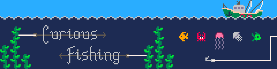
Curious Fishing
#08: (Work)flow: art
This post was originally written in March 2019. At the time the game was still called Hook, Line and Thinker
For the past few months I’ve been working on underwater currents: flowing water that pushes creatures and hook alike. I call them flows because currents was too confusing during loop iteration. I’m definitely going to write a post or two about both the design and technical challenges of this feature, because there were a lot of both. But I’ve just wrapped the feature with some nice art and I thought I’d write about my pixel art workflow.
I originally (devlog 1) started the game in PICO-8 and so inherited the 128x128 pixel resolution and the excellent 16 color palette from there. Many of the game’s sprites were first made in some form in PICO-8 and some have remained untouched in the ~2.5 years since then, such as the crab.
The PICO-8 pixel art editor is suitably simple. You have a few banks of sprites, a few colors, a few tools and no layers. These restrictions were what enabled me to start drawing pixel art in the first place; when the blank page is this small it’s a lot less scary. Drawing at this resolution often feels more like solving a puzzle than artistic expression: how do you make a 2-frame crab animation in an 8x8 space with just one shade of red?
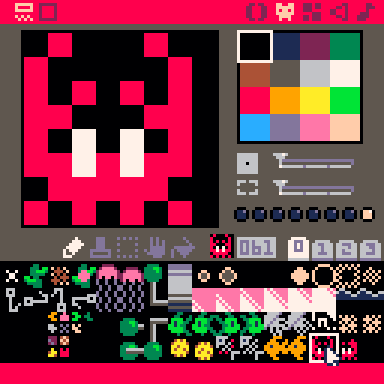
With the move to Defold and the need for larger, more complex pixel art I shifted to Paint.NET because I already knew how to use it, it was still simple and it had layers. It doesn’t do animations at all, but neither does my game for the most part! I’m now transitioning to what has become the industry standard for pixel art and for good reason: Aseprite. Aseprite does do animations as well as tiling and many other features, it’s great but I’m still quite slow and clunky with it.
How hard could it be?
OK so there’s only 16 colors and an 8x8 space and I need to make an animation for flowing water. There can’t be that many options, right? Well there’s actually many more constraints than that, because it needs to fit in with the many existing sprites using up that limited palette, it can’t be too distracting because this is a puzzle game, plus you need to be able to tell which direction a flow will push a creature while the creature is on top of it and blocking it from view. Hmm.
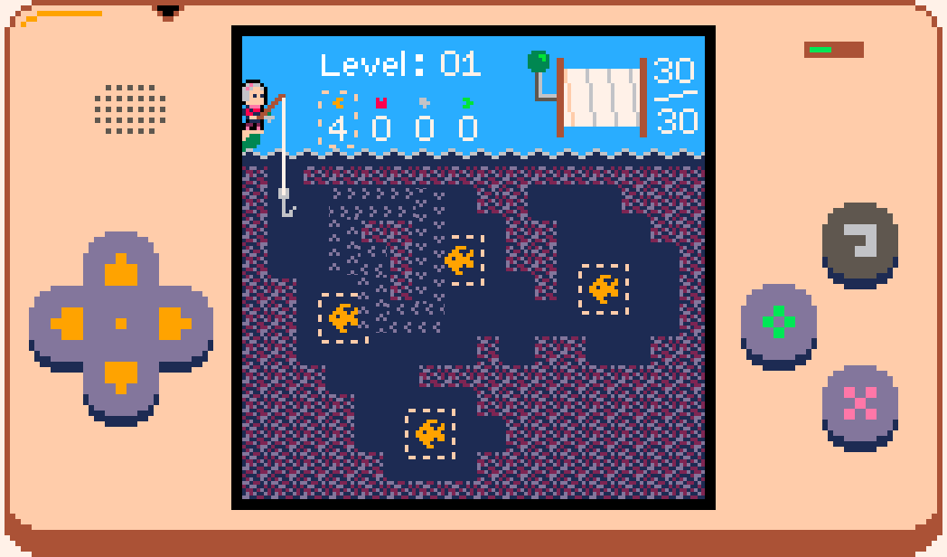
My first thought was a particle system. When the player enters a flow they lose movement control until the flow spits them out or becomes blocked; I figured some rapidly moving pixels would help convey the strength of the current. I had a quick go at messing with Defold’s particle effects editor but I’ve never used it before and knew it would be quicker for me to try the effect I had in mind by rolling my own ‘emitter’ which just moves sprites along and respawns them when they go too far. I stuck some flows in level 1 for quick access and fiddled with the speeds and number of particles until I had this:
That’s pretty much what I envisioned and I think it does look reasonably like a torrent of water. But it’s almost literally noise. The random, rapid movement was far too eye-catching and distracting. I wanted something more regular, so I quickly made a UV scrolling shader and drew several variations of an 8x8 sprite to wrap around. The Defold Shadertoy tutorial was helpful here in showing me how to pass a timer value into the shader.
In case you’re wondering about the colors, I have a debug flag set so that a random avatar and case palette (devlog 5) is chosen at startup so that I’m constantly confronted with the different designs and can tweak them if I see something I don’t like.
Note that we’re no longer pixel-perfect at a resolution of 128x128 (there’s sub-pixels in the scrolling) but this was just a quick temporary test. The larger waves looked less like water and more like conveyor belts so those were out straight away. I liked the intensity that the more densely packed waves had and how clear the boundaries were but they were too noisy with creatures on top of them; trying to focus on the creatures became uncomfortable.
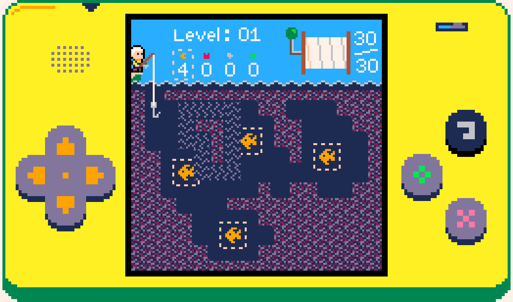
I used ScreenToGif to record these quick tests so I could put them all side by side and assess things altogether, as well as make sure I’m not trying the same things over and over again. Having all these GIFs lying around is what prompted me to write this devlog! Anyway, it was becoming clear that small waves were the way to go. So far all the designs I’d tried were completely behind the sea creatures. Most of the creature sprites touch all four boundaries of their 8x8 sprites which meant that the flow sprites had to as well so that a little bit of them would be visible around the edges e.g. under a fish’s tail. What if the flow went in front of the creatures instead? Then it could be smaller and go straight down the middle. After a few variations the best bet was this:
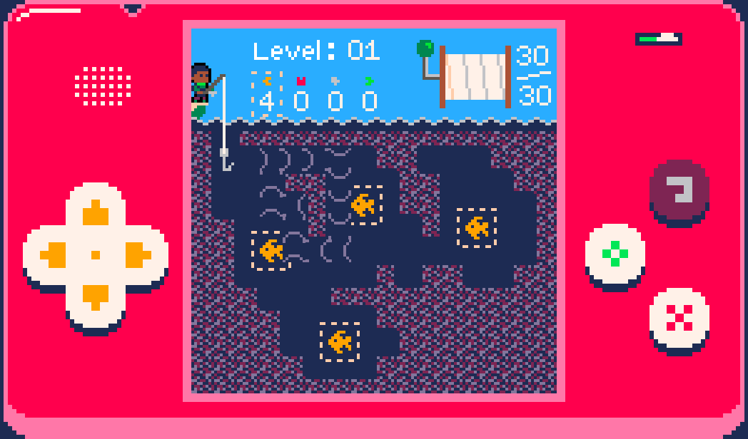
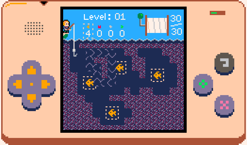
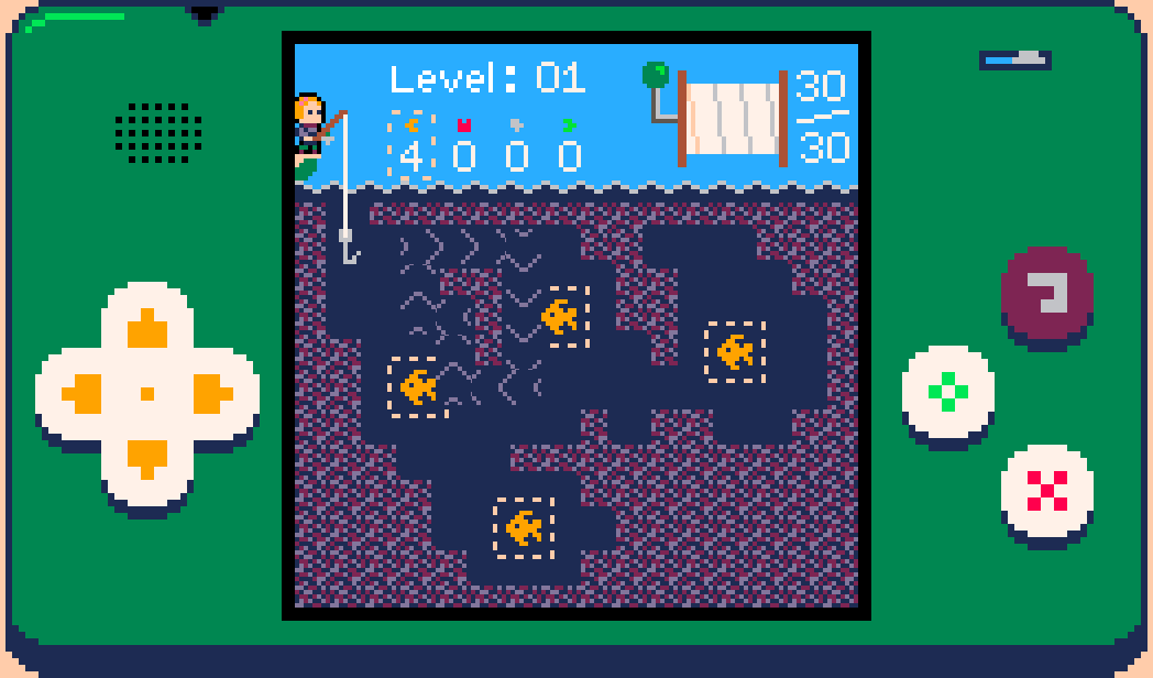
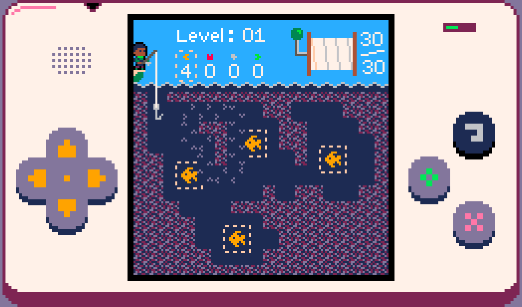
I really like the simplicity of this design, it makes the flow system as a whole very clear and easy to understand. It doesn’t really look like water any more though - it looks like UI, plus I really don’t like obstructing the sea creatures like this. The creatures are riding the flow, it makes sense for them to be on top. This is just a flow test level btw, not an actual puzzle.
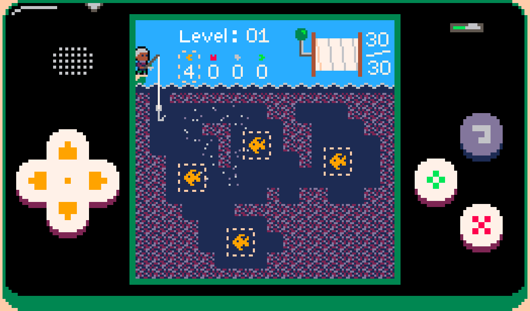
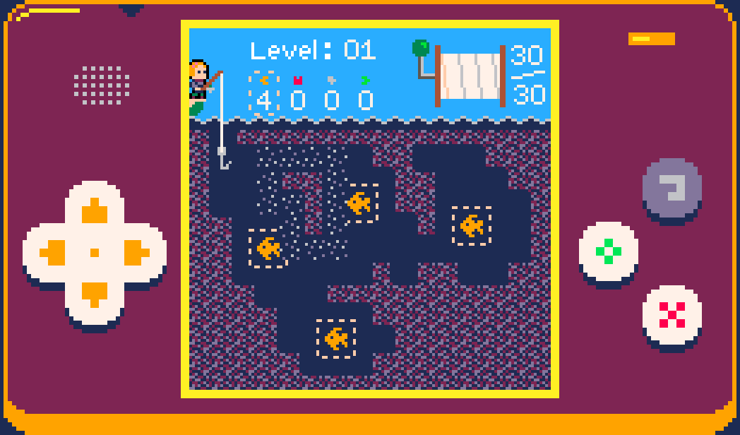
I went back to having the flow fully behind the creatures and after some more tweaks and color explorations I settled on this for the final version:
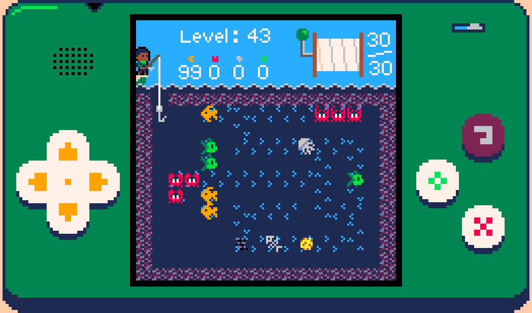
I think this has the best balance between all the different factors:
- Very clear which direction flow is moving
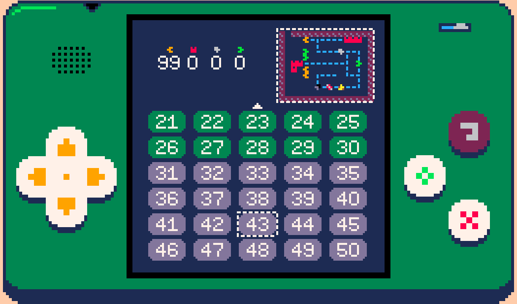
- Can’t be confused with anything else as this is the only use of light blue underwater (this is useful both in the game and for the minimap on the level select menu)
- You can tell what direction a creature occupying a flow will be pushed next tick thanks to the small gaps around the creature sprite edges and the vividness of the light blue (if you’re ever unsure you can always move then undo it anyway)
- It’s at least suggestive of a flowing underwater current, which with this resolution and palette is pretty good
- Not too distracting or eye-catching
- Not so noisy that it makes looking at creatures occupying flows uncomfortable
- Easy to see even on dim phone screens
There were also some happy accidents:
- Flow waves go either side of the line when the hook is pushed through them
- A 2x2 loop produces a whirlpool effect in the middle
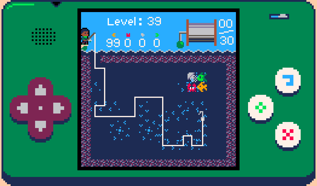
Downsides:
- If a position is surrounded on multiple sides by flows it can be hard to distinguish whether it is part of the flow system or not
- Dense winding paths with multiple directions next to each other are difficult to parse
The 3x3 minimap tiles were quite straightforward as I already knew I wanted it to be a dashed line. I did try animating it to show the direction of flow but didn’t like the effect.
Time flows gently ever on
From start to finish this was around ~7 hours of work for a single 8x8 sprite. Small sprites don’t usually take much more than an hour but there was no obvious approach so I ended up trying several things, plus there was an unusually long set of requirements/restrictions since flows interact with every other system in the game. Quite happy with it.
Leave a comment
Log in with itch.io to leave a comment.